The latest Valorant patch 6.07 did not have many changes to agents or anything major in the game. However, it made a little change that altered the experience of playing the game. The patch was released on April 11 and it made people raise some questions about Riot’s UI. The recent patch had a UI that popped up when you were in the range of getting affected by the utility. Now, UI is helpful in a lot of situations but this UI is just distracting. A lot of pro players and content creators think so too. Check out the tweets below!
Check Out Valorant Twitter’s Feedback on the Newest UI!
The primary reason players do not like the new UI is that it increases a lot of ‘clutter’ on the screen. The main screen is already occupied by the HUD which has abilities, a mini-map, and so much more. Adding another distracting element on the screen which is a huge semi-circle is ‘too much’ for people to see. It can distract a lot of players from the gunfight ahead. Let us see what Fnatic IGL Boaster had to say about this change.
How to get rid of this new UI? I don’t need it😂
— FNATIC Boaster (@OfficialBoaster) April 12, 2023
We agree with this statement. In addition, this change COULD be viable if RIot added a button that can toggle this UI On/Off. PRX Forsaken, another prominent player in the Valorant world also tweeted out his vote in making this UI disappear from the game.
me too!
— PRX f0rsakeN (@jasonsusantoo) April 12, 2023
G2 Dani was another prominent figure who wanted to get rid of this feature just because it occupied half of the screen. Check out what he had to say.
valorant please remove this new killjoy ult indicator, ty in advance. pic.twitter.com/GhuZrQX9m5
— G2 Dani 🇵🇸 (@DaniVAL__) April 12, 2023
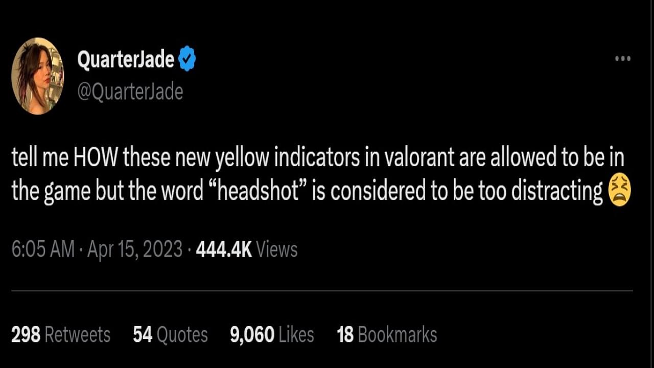
Content Creator QuarterJade also had a lot to say about this UI Indicator. Check out her Tweet below!
tell me HOW these new yellow indicators in valorant are allowed to be in the game but the word “headshot” is considered to be too distracting 😫
— QuarterJade (@QuarterJade) April 15, 2023
We agree with this statement. The word headshot was debated because it was too much ‘visual clutter.’ However, we beg to differ, this UI is actually more distracting to the player rather than a word. Of all the tweets we have seen online, a lot of people are asking Riot to either have a toggle on the UI or remove the whole thing altogether.
Maybe Riot can take feedback from these tweets and try to put something together than isn’t too distracting. We will find out what they do in due time. Meanwhile, check out this article to see the schedule of Valorant NA Split 2!

