Explained: Why McLaren F1 Cars Don Famous ‘Papaya Orange’ Color

Whenever the McLaren name comes up in a conversation, the color papaya orange instantaneously pops up in one’s mind. While the team’s current color came back in 2018, its actual history dates back to 1968, two years after the team’s inception in F1. Noticing a trend in rivals changing from neutral tones to popping liveries in the Can-Am sports cars, McLaren wanted to stand out from the crowd, and the orange color did the trick for them.
Not only has the color featured in F1 for the longest time, it has also made the iconic British team stand out in other series like IndyCar, Formula 5000, and F2. However, it took the team some time to find its true identity. Founder and former boss Bruce McLaren had to work hard for it.
How McLaren found its identity
Initially, with the help of Michael Turner, McLaren wanted to establish his Kiwi heritage on the grid. Most teams were British, and sported the famous British green on their cars (the color Aston Martin has today) so McLaren went for silver. That, however, did not stay on as their main livery color.
In 1967, Bruce decided to switch to red for a one-off race, to blend in with the crowd favorites in Monza. After that, however, McLaren opted to dress their 1968 car in orange, and success would immediately follow the team. According to the team’s official website, they also established a ‘corporate identity’ with the orange color they adopted. The Woking-based team won their first three races in Spa-Francorchamps, Monza, and Mont-Tremblant, marking the start of an unforgettable journey.
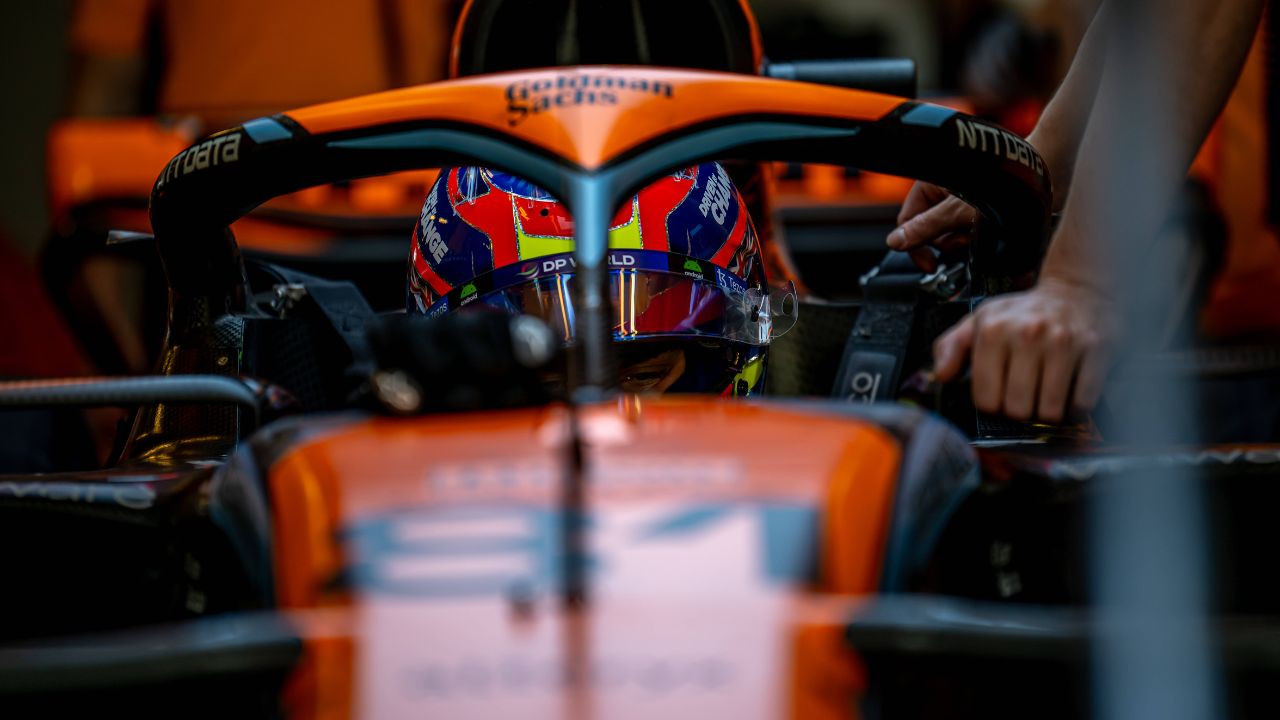
2024 McLaren livery: LAUNCHED!
Introducing our new look for the 2024 F1 season! #WhateverItTakes pic.twitter.com/n1nk6ImG5I
— McLaren (@McLarenF1) January 16, 2024
Away from standing out with its striking livery for the track-side fans, the orange color also made for an eye-catching livery on the fast-changing technology of TVs of the day. It quickly made for a financially beneficial venture for the sponsors, who understood that the added visibility made for better marketing of their brands on TV.
Moving from papaya to red and white
After the 1974 United States GP, McLaren decided to stop fielding a papaya colored car. Because of McLaren’s association with the Marlboro brand, they decided to change their livery too. It now became mainly red and white, and some of the best in F1 history – Ayrton Senna and Alain Prost – drove at their best during this time.
The Marlboro deal ran until the 1996 season, after which there was a lot of chatter surrounding whether McLaren would return to their papaya colored cars. Unfortunately, that was not the case but they did test several cars that had papaya in it. Mika Hakkinen, David Coulthard and Kimi Raikkonen too, drove cars that had the papaya color in it.
In the start of the 21st century, they slowly transitioned a chrome livery, which became famous thanks to Lewis Hamilton, and his incredible exploits in the car. But McLaren finally returned to having papaya in their car in 2017, and they have stuck to it since. Initially, it was just to pay homage to their history, but now they have decided to stick to the identity once again.
SEVEN. DAYS. #BahrainGP pic.twitter.com/g6QNaQXBmO
— McLaren (@McLarenF1) February 24, 2024
Addressing the continued relevancy of the papaya orange in the identity of McLaren, Zak Brown mentioned they want to keep their “papaya identity.” He added it was important for his team to give a nod to their past while also looking forward to the future. He gave the examples of Ferrari having associations with red and admitted to wanting to build a similar legacy with papaya orange.
History of the McLaren F1 logo
Since 1963, McLaren has had eight different logos in F1, each having its own significance to the team, as mentioned on their official website.
Their first-ever logo came in the form of a crest designed by Michael Turner, who was a famous motorsports artist and a close friend of founder Bruce McLaren. It featured a Kiwi in the center, paying homage to McLaren’s homeland. Five years later, the Kiwi donned a ‘Speedy Kiwi’ avatar, designed by Turner once again, this time representing the high speeds at which the McLaren cars were racing. The logo became the first logo of the team to incorporate the iconic papaya orange.
O nome seguiu até 81, quando a equipe passou para “Marlboro McLaren International” (cara, sério… kkkkk).
Mas não satisfeitos, meteram também o nome do motor e a partir de 88 passou a ser “Honda Marlboro McLaren”. A partir daqui foi um troca troca sem fim de nome. pic.twitter.com/ijKZKBTYHM
— fran (@midnorris) January 24, 2024
In 1981, the Speedy Kiwi logo disappeared after sponsor Phillip Morris asked Raymond Loewy to design the team’s new logo as a gift. They originally wanted to match the logo with the colors of title sponsors Marlboro but opted for rocket red as the logo’s background. In 1997, the three chevrons at the end of McLaren merged into one, creating the iconic speed mark.
Nine years later, the mono-black McLaren logo came along, marking the team’s foray into the modern-day logos. The trend continued till 2021, featuring font changes twice in the window but retaining the mono-black font with a red speed mark. In 2021, the latest logo came along, featuring an updated speed mark at the end of the logo, changing from rocket red to the iconic papaya orange.
About the author
-
Sabyasachi Biswas •
Citing His Experience, Fernando Alonso Presumes Lewis Hamilton Would Be Kept Out of Critical Mercedes Developments
-
Samriddhi Jaiswal •
Charles Leclerc Is Unconcerned by Max Verstappen’s Exploits on Day 1 of Testing
-
Aishwary Gaonkar •
F1 Team Principals 2024: Who Are the Bosses of the 10 Formula 1 Teams for the 2024 Season?
-
Tanish Chachra •
“I know I say this every year but honestly man we are so far behind”– Lewis Hamilton claims Mercedes will be lucky to have W13 on four wheels before Bahrain GP race
-

Tanish Chachra •
Romain Grosjean posts horrific injury scars in recovery update
-

Sabyasachi Biswas •
“Will No Longer Be There!”: Max Verstappen Reveals the Reason That Will Force Him to Quit F1