


A World of MLB Jerseys – Who Did it Best?

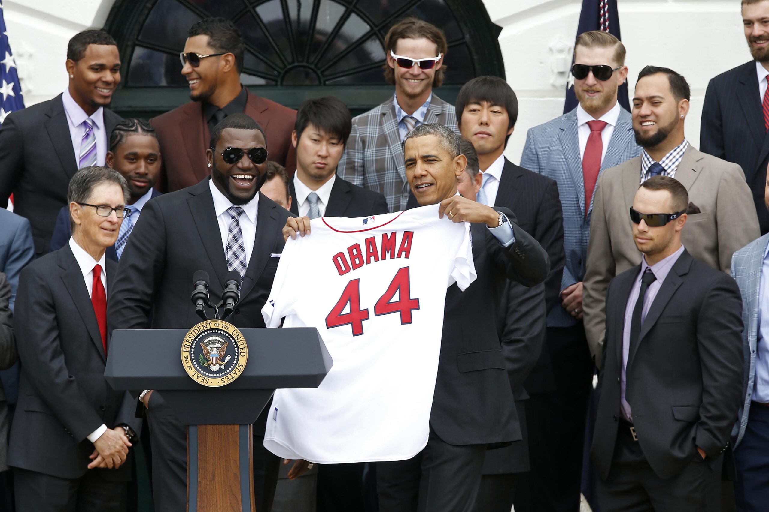
Every MLB team is limited to four jerseys, plus their City Connect jersey. A restriction the league and Nike call the “four plus one” rule.
As Cleveland revealed their new jerseys in November 2024, it reminds us that there are classics and some that designers hope don’t show up on their resume.
With the season quickly approaching, let’s take a look at who’s done it best throughout the years.
5. Montreal Expos – 1980-1991
#OTD in 1987, Tim Raines goes 5-for-5 and hits for the cycle to lead the Expos past the Pirates. 📷Ron Vesely https://t.co/OqY7ZpOwBg pic.twitter.com/rYn1HbJfmY
— National Baseball Hall of Fame and Museum ⚾ (@baseballhall) August 16, 2018
As a Montreal Native, this may be slightly biased. The nostalgia of the Expos logo matched with the classic “Bleu, Blanc, Rouge” colour way brings a certain familiarity to the heart.
Further, their logo is one of the more prominent in baseball history. The team’s official explanation of the emblem, is an upper-case “m” for Montreal, lower case “e” for Expos, and lower-case “b” for baseball fuzed together.
The colour way, alongside the logo is so iconic that even the Nationals (former Expos) resurrected the jerseys in a game against the Kansas City Royals in 2019.
4. Boston Red Sox – Home

What is there to say about such a classic jersey? The classic white, with red stitching down the buttons, paired with an immediately-recognizable font displaying the team’s name.
The jersey that needs no explanation.
3. San Diego Padres – Home 2020-Present

After many years of pleading, the Padres gave their fans what they wanted. In 2020, San Diego returned to their ’70s and ’80s roots.
They modernized the jerseys, adding pinstripes and a boxier font, but it worked out perfectly for the team, becoming a statement piece in the league.
2. LA Dodgers – Home

A timeless look. Clear white jerseys, the blue Dodgers script with red numbers below it. It’s hard to beat.
They haven’t made major changes or than switching the “B” to “LA” after their move to Los Angeles and adding nameplates in 1972. The Dodgers’ jerseys have remained the same, for a reason.
1. NY Yankees – Home

This is a surprise to no one. One of, if not the, most recognizable logos in sports history. Add that to a simple pinstriped design, and you have success. Oh ya, and winning 27 World Series titles in essentially the same jersey will help.
New jerseys will come, some will go. But what we know for sure, is that these will be the foundation that helped future designs fly.
About the author


-
Shubham Bhargav •
Peyton Manning Revealed That Russell Wilson Was Drafted Ahead Of Aaron Judge In 2010 MLB Draft & Even Wilson Couldn’t Believe It
-
Brendan Rubin •
“Apple TV+’s Friday Night Baseball 2025: Cost, Commentators, Shows, Exclusive Access and New Features
-
Dixit Bhargav •
SAL vs DOB Dream11 Prediction: Samsung Lions vs Doosan Bears Best Dream 11 Team for KBO League 2020 Match on June 16
-

Elliott Price •
MLB Division Series: Ohtani and Upsets
-

Samnur Reza •
Tom Brady Drops a World Series Reference on Yoshinobu Yamamoto While Calling the Lions vs Vikings Game
-

Elliott Price •
Alex Bregman Still Hasn’t Found What He’s Looking For