The Valorant 5.08 Update Blog Post reveals a complete overhaul of the UI in the game. More details about the UI below.
With the introduction of the newest agent, Harbor, who has an affinity to water, many other changes can go overlooked. That is why we will look at some UI changes that are getting overhauled in the next update, along with the newest agent.
If you want to know more about the newest agent and the backstory of Harbor, click on the article below.
Also Read: Valorant New Agent Harbor Abilities and Character First Look
Valorant 5.08 Update UI Changes Revealed
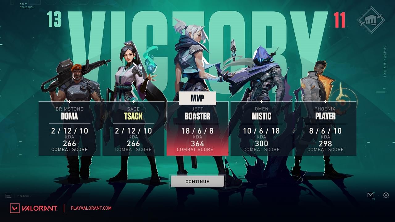
Firstly, there are slight changes in the MVP screen along with the pre-loading screen and End of the game scoreboards. This will improve the game’s overall aesthetic and provide clear legibility of the score, kills, ACS, and more. The dev teams are working extra hard t provide the optimal Valorant experience.
The details are explained in a slide-by-slide video format in the video given below.
Next up, there are changes to the faceoff screen right before the match loads up, which shows the player names in proper VCT-like format, which looks beautiful. The map and game mode appears in the screen’s center while the attacker and defender sides are on either side.
Talking about the various UI changes, Tea Chang, the UX Design Manager at Riot Games, had the following to say:
“We want you to understand the importance of the team aspect of VALORANT. This new, bold team shot helps to show off your team’s MVP and your team composition while reinforcing the emotional narrative coming out of your most recent game—win or lose. We also hope this helps you appreciate the beauty of our Agent visuals with a focus on continuity into the end of game screens.”
While Oliver Zumstein, Visual Design Manager, said:
“We wanted to remove a lot of visual clutter and improve the overall readability of the Lobby Screen. We had a lot of decoration elements that were pretty but didn’t really serve a purpose. In order to emphasize the Playercard and its representation. And to give you a clear ‘call to action,’ we increased the screen’s contrast, pushed color values, and simplified our shape language.”
These changes might seem trivial, but they will change the shape of the game due to its aesthetic and beauty appeal. The Faceoff screen prioritizes the clash between two teams rather than focusing on the map and game mode. This will be interesting to see, as players will feel more hype before the game starts.
Also Read: Twitter Reacts to Harbor: Valorant’s Newest Agent

